Choosing a Font for Software with a Global Audience
As more businesses are establishing a worldwide presence, our approach to software must consider globalization and localization. So when it comes to designing the user interface for our apps and websites, we must consider good typography.
Selecting fonts for use with multiple languages is an art but also a science. Here are the fundamental elements to take into account when choosing fonts for international products.
Locale Support
Determining the languages a font supports depends on the tools you are using.
If you are a macOS user, you can use the built-in Font Book app to get an overview of font-supported languages. Google Fonts also has a language dropdown that only shows fonts that support the language.
If you are paying for the fonts, you should make sure that the font supplier allows you to determine the languages that the given fonts support.
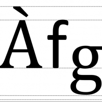
Diacritical Marks
A diacritical mark is a glyph added to a letter that indicates a different pronunciation, such as an accent mark. Your fonts should always support diacritical marks because leaving them out can often change the meaning of words, which is not the right localization approach at all.

Typeface Styles
It’s advisable to avoid using italics because some languages, like Arabic, have no support for it. It is better to avoid these style variances and instead use color or size to highlight or emphasize words.
Font Height
If you are choosing different fonts for different languages, you should consider the height of the fonts at the ascent line, which includes the diacritical marks. The fonts you select should have the same maximum ascent; otherwise, you will need to change the UI’s vertical spacing for every language your software supports. The lowest point, or descent line, also needs to match.

Using One Font
To avoid the problem of different line heights, picking one font that covers all selected languages could be a smart idea. It’s true that this approach is a bit more practical than attractive, but if the selected font matches your brand, it can save a lot of time and effort.
Google’s Noto fonts could be a good option. This open source typeface family includes more than a hundred writing systems and eight hundred languages, and covers all the scripts encoded in the Unicode standard.
Dynamic Layout
Some languages are more complicated than others and need more characters for a direct translation, so you need a design that gives flexibility for the expansion and contraction of different languages. The ideal rule is to plan for 35 percent text expansion on average. You can use development frameworks to get features that allow you to program for dynamic expansion and contraction of the UI.
In a world full of apps and websites, your business needs to reach a greater number of people than ever before. Selecting the right font for your product can give it an edge when it means that the UI is easily understood, accessible, and attractive in markets around the globe.
